
|
||
|
Portland art blog + news + exhibition reviews + galleries + contemporary northwest art
|
||
Barry Johnson: Commutatus (and more at the new Portland Art Center) First of all, stop into the Portland Art Center on 5th and Everett St. and take a look at the new space. The space is huge and has the great potential of developing art in Portland as a consolidated nexus. There are 10,000 square feet of exhibition space and art studios.
The space itself is a vast hybridization of gallery/ studio/ classroom/ warehouse. Most of the work over the past few months involved pushing the pendulum from "warehouse" to "gallery" and the final result is somewhere in between but closer to the gallery state. It still retains funky warehouse elements and is one of those spaces that could potentially liven up the sometimes sterile "white cube" network. The potential of this space is that it could become Portland's equivalent of important warehouse/ galleries like Pittsburg's Mattress Factory. The multiple levels and vast space at the Mattress Factory provide a venue for work that is simply impossible to show in a gallery because it is too huge. The strata of warehouse funk at the Mattress Factory also serves as a base material for installation artists to respond to in site-specific pieces. The first dimension of an installation can be the room itself, there is no need to transition between the "White Cube" space and the space of the installation. However, the strength of the Mattress Factory is not simply its unique space, but its excellent curation, and this is the same arena which determines the future of the Portland Art Center. Will the curation live up to the promise and challenge presented by the vast and eclectic space? I think if any city in the US can understand and support the curatorial aesthetic of the Mattress Factory, it's Portland. The curatorial task at hand is indeed huge, and demands exponentially increased levels of energy and precision in order to resist becoming diffuse and stagnant. The show on the upper level is a group show of recent OCAC graduates, and worth seeing. On the lower level there is a group show sponsored by contributions from individual galleries. The OCAC show is one of the best student group shows I've seen in a long time, and it has immediate cohesion due to the fact that all of the artists represented are graduating this year from the same school. The group gallery show on the lower level seems to be just a smorgasbord of galleries tied to the Portland Art Center, and apparently has no curatorial arc beyond advertising those galleries. Hexation II takes place in a seperate audio-visual gallery (the space is huge and diverse) and consists of several separate video pieces curated by Jason Frank and Any (Amy?) Brown. In the huge back gallery is Jeff Fontaine's Entropy and the Arrow of Time, This is a show of "paintings" on steel panels executed with a combination of pigment as well as different colors and textures of naturally occurring rust. This show is vast and sprawling, and the art seems like rapidly produced, decorative re-interpretations of the practice of collage and abstract composition. This work seems extremely commodified (art as product) and strikes me as constant re-organization of a single kitschy device in a myriad of similar forms, not as a cohesive body of work, but rather as one that is merely repetitious and marketable. 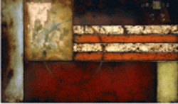
I take the title to refer to rust as an entropic process, but it just so happens that Entropy and the Arrow of Time is also the title of Chapter 9 of Stephen Hawking's A Brief History of Time. With such a specific reference it is hard to resist re-reading the source of the language. In Chapter 9 Hawking discusses the coincidence of the direction of entropy and the direction of time, using the metaphor of aligning arrows. He goes on to suggest the possibility of a universe in which the arrows do not align. In this space things would become more ordered as time progressed, broken things would tend to fix themselves. It is unclear why this artist would make a specific reference to the complex issues of Chapter 9 of Hawking's book when it seems most likely that the reference is only to the process of entropy, and these simplistic, product-centered works suggest nothing about the relationship between entropy and the arrow of time, other than the obvious: that they coincide. In the large central space there is a temporary gallery structure. The space is so large that it can concentrically embed one gallery inside of another without feeling constricted at all. 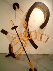
The temporary gallery houses Barry Johnson's Commutatus. The Latin word Commutatus means change/ alteration/ exchange/ interchange and functions as either a noun or an adjective. It is interesting that the root of this word is the same word Pat Boas chose for the title of her show last year at PCC Sylvania: Mutatis Mutandis. It would be cool to curate a group show with the theme of change or mutation as it is apparently a powerful generative idea for individual studio practice. I think there is nothing wrong with artists using Latin for their titles, as it provides a sort of abstract semiotic system to respond to visually. It leaves a gap in meaning in which the artist can visually interpret the "feeling" or spirit of what is, for us, a new word. However, as an aside I must mention that I think made up, "Latin - sounding" titles are very annoying. Not that I have a problem with artists making up words, but I don't see the point of disguising them as Latin. James Joyce's portmanteau words are among the most beautiful and complex constructions in the English language, but it's easy to immediately recognize them as constructions. Even J K Rowling does her Latin homework, and all of Harry Potter's spells are either true Latin words or just slightly changed. The university of Notre Dame has created a great Latin Dictionary/ Grammar construction interface that can give you all the information you need: University of Notre Dame Latin Grammar Personally, I'm currently interested in ancient Roman profanity as found in the writing of Martial and Suetonius. For instance: An refert, ubi et in qua arrigas? Does it make any difference to me who made you horny, or when? 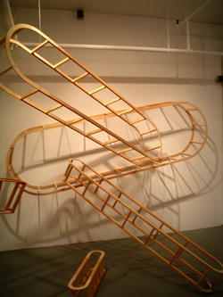
Anyways, another time perhaps. Barry Johnson's Commutatus translates the virtual space of drawing into the actual space of sculpture. His forms are as fluent and lively and as complex as large scale charcoal drawings. He's not overly focused on woodworking skill and I think this is a strength rather than a weakness. The forms, as extensions of drawing, are the most important and Johnson's construction methods primarily facilitate those forms. 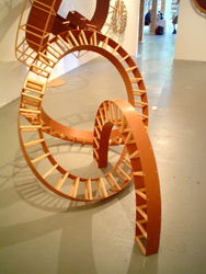
I think this is an ideal show for a student to closely examine, it shows how simple methods can create incredible spatial dynamism. Much of this sculpture is constructed only from square stock and thin, curved particle board, technical strategies any student can immediately understand. Using facile building techniques allows Johnson to concentrate wholly on how the forms shape space: the sculptures are as fluid and immediate as drawing. 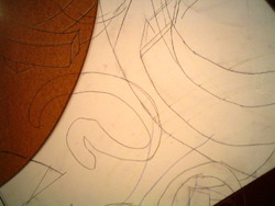
One piece in Commutatus gives a clear transition between two-dimensional drawings and three-dimensional spatial dynamics. It lays flat against the wall and is covered with drawings that act as diagrams which inform the rest of the show. In examining the drawings, you can clearly see the two-dimensional forms that emerge into, and are fully expressed in three dimensions in the other sculptures. The lights in Commutatus are carefully engineered to incorporate the complex shadows cast by the pieces into the spatial compositions. The importance of the shadows provides another juncture between 2-D composition and 3-D space. The shadows musically resonate the spatial harmonies created by the sculptures and further complicate the elaborate visual rhythms. 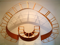
Commutatus successfully creates a complex space that is not overpowering, but relies on musical subtlety and the issues present in dynamic drawing for its strength. The show also has a synaesthetic dimension. The artist includes music in the gallery which contains similar structural themes of intricate dynamism. I found the synaesthetic component of the show mostly successful, except for the inclusion of the O Fortuna chorus from Carmina Burana. While this is no doubt a beautiful passage of music, it has been so beaten to death by pop culture that whenever I hear it I immediately generate a phantasmagoria of its pop referents (the end of Final Fantasy VII/ warm-up at football games/ broadsword battles atop rainy rooftops/ etc. etc.) Mostly I visualize Batman flying above the silhouette of Gotham City, protecting its inhabitants from criminals: a cowardly, superstitious lot. But perhaps the O Fortuna chorus from Carmina Burana hasn't been catastrophically ruined for you by pop culture, and you may not even experience this effect. I hope this is the case because it really is a beautiful piece of music. The artist's talk is July 13th at 7pm. Barry Johnson • Commutatus • Through July 23rd • Portland Art Center • 32 NW 5th Ave. • Portland, OR • 97209 • 503•236•3322 • portlandart.org Posted by Isaac Peterson on June 06, 2006 at 23:46 | Comments (2) Comments Yes Johnson's show is decent but it tries to do too much (adding sound to an already busy show?). The effect diffuses the good individual elements of the show. I agree with the other show assesments. *also unrelated news: stay tuned, PORT will soon be announcing an event on June 15th for our 1 year anniversary. Posted by: Double J Johnson's sculptures were sleek and considerably simple, yet I felt the music was too much as well. Why add music to sculptures that already have so much rhythm they nearly sing themselves? And I definitely agree with Isaac's recommendation for students on this one. Posted by: Calvin Carl Post a comment Thanks for signing in, . Now you can comment. (sign out)
(If you haven't left a comment here before, you may need to be approved by
the site owner before your comment will appear. Until then, it won't appear
on the entry. Thanks for waiting.)
|
| s p o n s o r s |
 |
 |
 |
 |
 |
 |
 |
 |
 |
 |
 |
 |
 |
 |

|
Site Design: Jennifer Armbrust | • | Site Development: Philippe Blanc & Katherine Bovee | |


![[TypeKey Profile Page]](http://www.portlandart.net/nav-commenters.gif)