
|
||
|
Portland art blog + news + exhibition reviews + galleries + contemporary northwest art
|
||
Hanging Judge: quick and dirty reviews This is the last weekend for a few worthy shows that you might want to check out.
Here is a flurry of short reviews to help you decide.
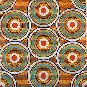
Rae Mahaffey,Concentric IV (2006) Rae Mahaffey's latest show at Laura Russo Gallery continues her fascination with overwhelming pattern, neoplasticism and trompe l'oeil wood grain effects… somewhere in the realm of David Reed meets Victor Vaserly. The best works are the most densely patterned and we would like to see her execute something on a grand scale. The safer pieces look like they were created to suit the typical ideals espoused by new condo owners in the Pearl District. Buy the ones that confound any eye instead, they are nautilus machines for your eyes. Yes, Rae is one half of the Mahaffey Print Studio, which just completed an excellent project with international political-art luminary Hans Haacke called Mission Accomplished, contact the Liz Leach Gallery for info. 
Shin Tanaka's first solo show at Compound is not to be missed. His army of T-Boy paper figures showcase the power of t-shirt and sneaker design like a mass of terracotta warriors from some imperial grave, 'cept of course the empire is one of design and these figures brilliantly complicate the line between fine and applied art, prototype and finished piece. Rather inexpensive too at only $85 for the big-uns. 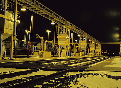 Craig Payne's Evening Tracks Portland Modern at the newly relocated PAC boasts a lot of good work, the best of which are by TJ Norris and Craig Payne. Norris has been reviewed here recently but Payne sneaks into industrial locations and shoots incredibly delicious looking color shots of probably toxic facilities (more Hopper in feel than Burtynsky). This conflation of food consumption and consumption of natural resources would be boring if it weren't so wonderfully executed. The show as a whole is a mess though. It's poorly scaled to the space and a tad pottery barnish. Why use this terrible carpeted and bourgeoisie as hell space when you also have access to gloriously cool industrial roughness in back? Also, at Portland Art Center is Arcy Douglass' Barge. This show tries to do too much and gets confused while trying to make paintings act as installation art. It simply takes more than a few wheels to make paintings act like an installation and besides the barge itself is just a half finished movable wall. Instead of the institutional critique of Jim Lambie it looks like a half-finished yet over-hung show. That said… some of these paintings are very well done... a massive scaled conglomeration of Cy Twombly and Anselm Kiefer. My suggestion, take all the paintings out of this show but the wonderful one you first see on the barge. Then light the lone work dramatically in the cavernous space… that might be something. What is it with the Portland Art Center hangs this month? You are being watched so closely, don't settle for iffy look'n shows. Actually, that goes for all would be institutions. For example, I can't for the life of me understand why most every 501.3c institution that partners with Portland Modern somehow lessen the good work PM does with iffy presentations (but gallery spaces like ogle and 114 do a good job). Grass roots level art institutions should adopt a motto like Google, "do no evil," … the bigger institutions are better equipped to dole out evil anyways! (but of course we love the necessary evil that museums do). OK let's just note that Portland's scene is a great deal more sophisticated than its institutions and this has manifested in the artists being intolerant of bad hangs. It's a nice development. Along those lines I thought Chas Bowie's photography at Chambers was his best to date but the hang just doesn't cut it. The matte photos on white paper set flush against the matte white walls all cramped are distracting… cut out half the work, float the photos with pins, set up some rhythm, address scale and suddenly you've got a great show. LeAnne Hitchcock's photos fare much better, in fact the show is completely sold out. Let's just say that in the visual arts presentation matters… hell even Duchamp had an eye, despite the fact he purposely sought to undermine it. 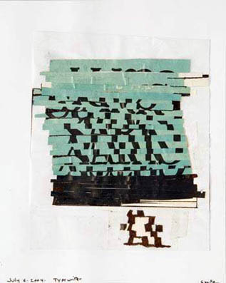
Judy Cooke's Typewriter Last but not least check out Judy Cooke at Elizabeth Leach. The stars of the show aren't the paintings, which are the best she's done since her canvas tarps, instead it's the sketches. Works like Typewriter, are so unfussy and well done (a hint of Klee and early Ellsworth Kelly) that I'd really like to see her do these as larger scale pieces. Will Judy go raw again? Posted by Jeff Jahn on February 22, 2006 at 23:01 | Comments (2) Comments It's rather obvious that the Portland Art Center Annex space isn't ideal for exhibiting work - ugly carpeting, beige/gray cement walls, etc. It should be noted, however, that the use of this space is strictly temporary as the Art Center works to build out the rest of the building. Rather than spending their resources (time, labor, and money) on renovating a space that will not serve the center long-term, they are focusing on the larger goals of the building and institution. It makes perfect sense. It also explains why Douglass' piece is on wheels and titled 'Barge.' As the back areas of the Art Center undergo construction over the next few months, 'Barge' can move about the space in ways that traditional work cannot. Your bias toward 'gloriously cool industrial roughness' is apparent, but you have yet to present a compelling argument for why an unfinished industrial space is less distracting to art viewing and installation than the space currently used by the Portland Art Center. Posted by: MB Au contraire mon frere, the argument is there. The the ugly biege carpeted space could be configured to look and work a lot better while spending few if any resources. When you are being judged on every move you make it's very important to send the right signals... otherwise it is a missed opportunity. I simply point these things out publicly so something can be done. Hundreds of private citizens have walked in, made up their minds and walked out. Many of the more sophistcated ones note what I note and that hurts. Also, I just made an academic point about the industrial space because construction hasn't begun yet. The real issue is the "beige space" lacks a hang that is sensitive to its constraints. Many of the artists felt similarly. PORT is dedicated to such noting such details. The barge as a pragmatic solution is fine in theory. The problem with it now is it seeks to analog a finished room clumsily. That hang is just a retatement of conventional ideas seeking to be unconventional. Im certain it will be improved upon in its next configuration. I have a lot of faith in Arcy, he's a bright artist and talented (it's a great learning process and opportunity PAC is providing). I like the idea of this improving as the space gets changed... you live, you hang, you learn. ...the thing is in the visual arts you will always be judged. Posted by: Double J Post a comment Thanks for signing in, . Now you can comment. (sign out)
(If you haven't left a comment here before, you may need to be approved by
the site owner before your comment will appear. Until then, it won't appear
on the entry. Thanks for waiting.)
|
| s p o n s o r s |
 |
 |
 |
 |
 |
 |
 |
 |
 |
 |
 |
 |
 |
 |

|
Site Design: Jennifer Armbrust | • | Site Development: Philippe Blanc & Katherine Bovee | |


![[TypeKey Profile Page]](http://www.portlandart.net/nav-commenters.gif)