|
||
|
Portland art blog + news + exhibition reviews + galleries + contemporary northwest art
|
||
Report from France (Part II) Fictional Geographies For some, the creation of imaginary terrains involved the more literal creation of fictional geographies, visual counterparts that provided a place for the mind as well as the eye.
In Palais de Tokyo, a large-scale mural by Sarah Morris conveyed the complex, sun-drenched surfaces of Los Angeles, recalling the sides of shiny skyscraper towers, the disorienting surfaces of shimmering pools in LA's backyards, and the frenetic energy of the southern metropolis for which the series is named after. The paintings of New York-based Danielle Tradeger at Galerie Xippas take the Neo-Geo conduits of Peter Halley backwards in time to embrace a Modern aesthetic. A complex of thin conduits network muted rectangular nodes, angular Modernist abstractions and Klee-like paintings within paintings. At times, these semi-ordered grids give way to a more organic wilderness, hinting perhaps at a struggle between the urban infrastructures of the imaginary cities that these paintings map and the wild spaces that they civilize. However, the paintings, with their overworked illustrative style and decidedly retro palette prove to be quite static, taking away any sense of discovery or exploration within these imagined urban spaces.
Skipping through decades of art history and dozens of styles, Bernhard Martin's large sculptures are comprised of a tangle of fractured surfaces. Mirrored pieces are intermingled with transparent plexiglas panels, creating a three-dimensional illusion of multi-planar compositions that share a Cubist's love for severely disrupted planes. But Modern it is not, as Martin has an aptitude for executing his work in a violation of style and genre that is shamelessly contemporary.
In his exhibition at Galerie Thaddaeus Ropac, Martin showed his large sculptures alongside surrealist/psychedelic/goth/kitsch paintings in black and chalky pastels as well as smoky black and white reliefs depicting everything from smiling (or perhaps grimacing) pearls nestled inside clamshells to an abstract explosion of spheres in space. From the press release: "I am interested in worlds, islands, rarities, biotopes, contrasts that clash - in short, everyday life." Disorientation
At Yvon Lambert, Jeppe Hein led us down a path of disorientation, constructing a mirrored labyrinth that, like Martin, dissolved the expected grid of planes. The work of Danish-born, German-based Hein borrows the formal singularity and precision of Minimalism, but in what has been aptly deemed "interventions," Hein inserts a forced and often playful interaction between viewer and object. In the monologue Until Now, Francesco Bonami eschews the term "interactive artist" in describing Hein's work because "interactive art never works, and Jeppe Hein's projects usually work quite well." Hein is able to follow a delicate path making work that engages the space and viewers around it, while maintaining a consistent dialog with Minimalism and formal white cube considerations.
Hein's interest in labyrinths has been an ongoing one, and previous works have included labyrinthine fountains at the 2003 Venice Biennial that entrapped passers-by and invisible labyrinths defined only by sound and vibration transmitted through headphones. In Simplified, Hein uses the reflectiveness of mirrors to play with the idea of being inside and outside, as well as to disrupt one's spatial orientation within the space. Although the labyrinth dominates the gallery, viewers often find themselves on the perimeter of the space, led by several entrances into the installation, while their image remains reflected on the inside. The reflective qualities of the mirrored walls dissolved surface, creating disorienting spatial relationships between viewer and object as well as viewer and viewer. Hein's piece formed a fitting counterpart to Sol LeWitt's wall piece enacted in the entryway leading to the gallery, which also played with the illusory dissolution of expected surfaces.
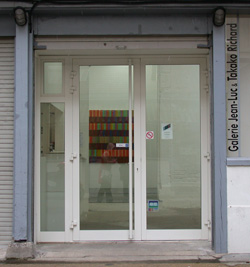
One for the West side Tim Bavington's abstractions don't delve into imaginary terrains, but it's worth mentioning his solo show at Galerie Jean-Luc & Takako Richard. A painting-based gallery that is preparing to move next door to Emmanuel Perrotin, Galerie Richard's roster of sexy abstractionist painters include Yek, who, like Bavington, is based in Las Vegas and studied under Dave Hickey in the late 90s. Continuing his musically inspired stripes, Bavingon exhibited a similar body of work to what was on view last fall in New York's Jack Shainman Gallery. Straying slightly from the sensibilities of earlier work like 2003's Voodoo Child in the Portland Art Museum's collection, Bavington uses a slightly darker palette and expanded vocabulary of compositional devices. Horizontal canvases typical of earlier work showed more restraint, as the pulsing series of colored lines were tempered by large fields of flat color flanking each side. In the vertical Out of My Hands, the reference to Barnett Newman was updated by a refreshing sheen of pop savvy. Two canvases, built with sharply angled top and bottom edges, created an active plane that subdued the bright colors of Bavington's colored stripes. Several other large-scale paintings explored horizontal bands of alternating color sequences, weaving together a more complex composition that adds visual equivalent of static, like crossed channels.
Report From France: Part I (Nature) Posted by Katherine Bovee on January 27, 2006 at 11:27 | Comments (0) Comments Post a comment Thanks for signing in, . Now you can comment. (sign out)
(If you haven't left a comment here before, you may need to be approved by
the site owner before your comment will appear. Until then, it won't appear
on the entry. Thanks for waiting.)
|
| s p o n s o r s |
 |
 |
 |
 |
 |
 |
 |
 |
 |
 |
 |
 |
 |
 |

|
Site Design: Jennifer Armbrust | • | Site Development: Philippe Blanc & Katherine Bovee | |


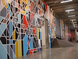 Sarah Morris, Endeavor [Los Angeles] at Palais de Tokyo
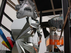 Bernhard Martin at Thaddeus Ropac
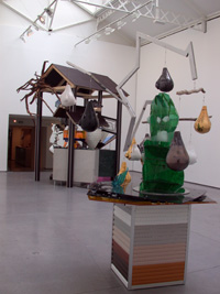 Bernhard Martin, Ichling + Duling installation view
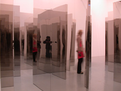 Jeppe Hein, Simplified
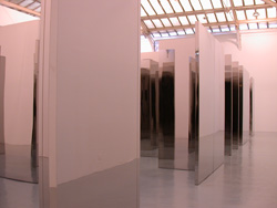
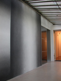 Sol LeWitt at Yvon Lambert