
|
||
|
Portland art blog + news + exhibition reviews + galleries + contemporary northwest art
|
||
First First Thursday Photoblog part 2 Ok, I'm going to finish my photoblog with this post, and I hope you'll forgive it being silly and jittery. Also, I really like people leaving comments and filling in the gaps in my coverage and or thinking so please continue to do that. Hopefully this will give you an overview of the experience even if it doesn't provide a thorough analysis.
So, this is PDX Contemporary. The new show is by Victoria Haven, entitled "The Lucky Ones". I only got a few images here because the delicacy of the work made it difficult to photograph. In essence, It appears to be intricate, architectural structures drawn or painted on paper. Mostly the ink or paint seemed close in color and value to the paper itself, and while this made it almost impossible to photograph, it made the images seem to float on the page. The work is simple and ephemeral, and communicates the primary rudiments of space without mimesis. When comparing it with Cynthia Lahti (the last show at PDX) it seems a curatorial arc is emerging having to do with delicate, spare drawings on fragile paper...or art as ephemera 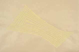
The best show of first first Thursday 2006 was Icelandic artist Hildur Bjarnadottir's "Overlap" at Pulliam Deffenbaugh. To fully experience this show, don't read any of the press releases. In fact, stop reading this article right now and just go and see it. really. I mean it. That's the way I saw it, knowing nothing about it. The work operates on such a high level of subterfuge that initial impressions give you almost no entry whatsoever into Bjarnadottir's aesthetic. Looking around at the series of blank canvases and table cloths pulled taut over stretchers, I found myself thinking: "What is this? Some kind of high concept rhetoric about the irrelevancy of painting? Ooo, a blank canvas! Like there's nothing left worth painting? Or a table cloth... like painting has failed because it cannot provide the same sustenance offered by an evening meal with family?" However, Bjarnadottir's body of work is not some smug, rhetorical show of art critizicing itself, but rather a dense and serious show of finely crafted objects. The work does address the larger discourse of painting, but is intricately layered with personal and cultural meanings. The depth of these associations doesn't come to the surface until one understands the process. Bjarnadottir paints individual threads with artist's colors and weaves them into a tablecloth or "blank" canvas before stretching the fabric over the frame. The tablecloth patterns follow traditional Icelandic textiles. So Bjarnadottir sublimates the elevated tradition of painting into the "low" craft of textile weaving. The final product is totally mute. When considered as a painting, it communicates nothing at all, but suggests the possibility of cultural meaning in the silence of the discourse of painting. Generations of ordinariness are suddenly seen as an unrecognized aesthetic, an Art History of the mundane, in which thousands of people have silently invested their labor. Could there also be an Art History of washing dishes? It would go through the same revolutions as the Western Tradition: Jan Van Eyck's introduction of oil paint would be an analog for the first use of liquid dish soap... 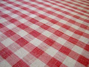
Gingham/ Cadmium Red Medium I won't tell you everything about the show here, but the most breathtaking objects are Bjarnadottir's handmade lace doilies impregnated with graphite. In looking at these I think about the futility of the process, pushing graphite into a limp surface not designed to accept it.... And the doilies cannot now be called "pretty". They hang heavy and metallic and solemn on the wall, bare and unframed, staining the white cube with silvery gray. They are out of place in the gallery and almost unrecognizable. Eavesdropping, I hear a lot of conversations that go like this: "What are they? Are they sculptures? Are they metal?" This is a dense show which must be visited quite a few times to grasp Next I went to Beppu Wiarda Gallery for a three person show entitled "Authenticity of First Hand". I must say, its great to be alerted by the title of the show that what you are seeing is authentic and that you are not at a second hand store. The three artists were James Jack (Ink Drawings), Rainy Lehrman (Sculpture) and Tyler Schlicting (Painting). This work seems like excellent home decor, and I was mostly interested in Rainy's sculptural furniture, especially what seemed to be a kinetic coffee table with a round base, which you could set rocking by pushing on it. Its form disrupts its function, unless I am mis-interpreting this piece, and it is not, in fact, a piece of furniture. Because I am reading Stephen Hawking right now, who explains entropy with the image of a teacup falling off of a coffee table and breaking, I can't help but think of this as an "entropic coffee table." I don't know what Stephen Hawking has to do with art exactly, but I am really interested in his writing about the arrow of time. He posits that the human perception of time as linear is pure functional illusion. We have adapted to percieve time coincidentally in the same direction as entropy. Our psychological experience of time merely follows entropy because it is useful to do so. The possibility exists then to cultivate non-functional consciousness to the point that you can remeber the future. Of course I'm excited about this, but in trying to discuss this with my friends, people keep telling me I'm taking it too literally, that Hawking is describing mathematical models, not experience itself. And I guess ultimately I have to concede, when you just say "I'm cultivating non-functional consciousness so that I can remember the future," it does sound kind of silly. Rainy's kinetic coffee table Tyler Schlicting Chloe and Rainy at Beppu Wiarda Next I went to Powell's BH gallery in the pearl room for a group show of drawings by Hayley Barker, Tara Jane O'Neil, and Zefrey Throwell. This show explores how detailed, specific and intimate drawing can be. Throwell's work is illustrative figurative naturalism charged with particularly savage narrative. Here's a strange coincidence: it turns out Zefrey and I went to high school together in Juneau! So the last time I saw him was at these dim parties in Alaska twelve years ago when we were both 17 or 18. I guess that fact offers little insight into the artwork, but I just have to mention it, because it kind of blows my mind! I have to remind myself that this is a first first thursday diary and not an art review. So it's ok for me to include some tangents and personal information, right? I mean isn't that totally weird? Well, my new year's resolutions are to be meaner and less hyperbolic. But it seems I'm having trouble giving up hyperbole so I'll just have to take it one step at a time. So, I'm going to try to be mean here, or at least strict and difficult to please, but I fully expect a vigorous response to the following comments. What is up with Rake? This is from their vision statement: Rake Art Group started with a simple idea: creating a community for emerging, independent, and underground artists' voices to be heard. Rake's founders envision Rake Art as a way to show experimental, progressive, intelligent and articulate artwork. I mean don't get me wrong, I think that Jenna Kane has made some fine landscape paintings in the current show, "Impressions of Summer Landscapes: From France to Oregon", and I understand that Rake is a not for profit co-op and I admire that it promotes emerging local artists. I can see immediately that the presence of Rake is good for the arts community in PDX. However, when you dedicate a new gallery to experimental and progressive art in the vision statement, it seems somewhat incongruous to go into such a gallery and see traditional neo-impressionist landscape paintings, even if they are great landscape paintings. I understand that Rake is in the process of building its venue, but the vision statement expresses high aspirations that I'm not quite sure are reflected in the shows. I would like to see Rake fulfill its aspirations but right now it seems more like it is aspiring to be a commercially successful gallery rather than an "experimental" gallery. Which I suppose is fine. After all, if it isn't financially viable, it won't be around long enough to become experimental. Maybe I want too much. A not for profit co-op is a great thing. It means more young artists get exposure they would never have otherwise, and I don't know what running a gallery is like. But I can't help thinking: this could be so much more. I hope the Rake organizers will not be afraid to deviate from pure commerce in the future, and I hope Jenna sells her whole show, because they are lovely landscapes and worth the price. Well, that wasn't even very mean was it.... baby steps... Oh another thing! What does that mean, "Rake?" is it just a cool sounding word? Was it chosen at random? Is it a metaphor for the co-op?: "Many prongs, one tool."? Is it a metaphor for painting? Like the rake is an analog for the brush and paintings are as necessary as the earth, as pleasing as the grass beneath our feet? I think there is something to choosing names of galleries with care. Take Dave Hickey's "A Clean, Well Lighted Place". You get an idea of his curatorial vision even in the name. That he sees the gallery as a human space, and art as an optimistic practice through which the human experience can be more deeply understood. And that he likes Hemingway. And the following is a co-op members show in back room of the gallery, which has a nice stage, I might add... There is window between Rake and Artifact on 6th street which contains an installation, although I am unsure which gallery it is associated with, my intuition suggests it is part of Rake. I have no idea who the artist is or what the work is actually about. My powers of analysis seem to be failing me. The piece seems very cinematic, and depends on sort of a shock reaction to seeing a human skull, I guess the same kind of feeling that is intended in Indiana Jones when a skeleton suddenly falls out of the ceiling on top of Jones' intrepid love interest. It seems very staged. Clay skulls sit atop rebar stick figure structures with giant camoflage abstract patterns painted in the background. Is this a political statement about the military's role in foreign policy? Is this about Iraq? or Cambodia? Did this artist confuse Pol Pot with Pinch Pot? Please comment and let me know more about this piece....I feel like I'm missing something really obvious... Here are some selections from Amelia Santiago's "Circumscription" at Artifact, which I present unencumbered by my insights... Next I went to the Pepper Gallery, one of the small storefront type galleries associated with Everett Street Lofts. There was a blues band there whose sound was much too big for the small space, and I was so overpowered I didn't get a chance to look at the art, but in the interest of diaristic veracity, I am publishing the photos: Here are two street urchins with "hearts of gold" I saw on Everett St..... "Please sir, won't you buy my wares?".... "Please sir, would you like to buy a burnt matchstick?" Well, this post is getting absurdly long as it is, and I have more yet to go, so I'm going to have to do a part three tomorrow.... Posted by Isaac Peterson on January 06, 2006 at 13:58 | Comments (0) Comments Post a comment Thanks for signing in, . Now you can comment. (sign out)
(If you haven't left a comment here before, you may need to be approved by
the site owner before your comment will appear. Until then, it won't appear
on the entry. Thanks for waiting.)
|
| s p o n s o r s |
 |
 |
 |
 |
 |
 |
 |
 |
 |
 |
 |
 |
 |
 |
 |
 |

|
Site Design: Jennifer Armbrust | • | Site Development: Philippe Blanc & Katherine Bovee | |
