|
||
|
Portland art blog + news + exhibition reviews + galleries + contemporary northwest art
|
||
out there on the inter-heck Edward Winkleman has a great post on the recurring death of arts funding. 
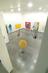
Also, Chas Bowie at the Mercury chimes in on the new Portland Art Museum and writes some similar things to my PORT review about the hang. He is absolutely right but many museums who have had their collections mothballed intentionally overhang for their openers and it can be fixed. It is a way to get key aquisitions as well. Still, he misses how absolutely crucial (but unglamourous) office space is to running a museum. At 28,000 sq feet of new galleries it adds a great deal more than the recent Walker expansion did. Besides, it isn't like the staff didn't have their offices in the other half of the wing before the renovation. Prior to the renovation they lacked air conditioning as well and Portland does get uncomfortably hot during the summer from time to time. In a smart move the offices have been designed so they can be easilly turned into gallery space in the future. Lastly, does the rental sales gallery have to be housed on museum grounds? Nice that the collection is stronger than expected though. Posted by Jeff Jahn on October 13, 2005 at 23:55 | Comments (5) Comments Actually, having previously worked in museum offices, I am familiar with their importance to the overall function of the institution. That said, many, if not most, museums have been able to strike a balance between having administrative wings and giving their collection a proper presentation. 28,000 square feet is an impressive size, but not if it's poorly used. A 7000 foot hallway four feet across also measures 28,000 square feet, but that doesn't make it a good museum space. Finally, I hope you are correct and that PAM will thin the installation out within the next year. Posted by: Chas Bowie i would definitely enjoy visiting a museum space with a 7000 foot long hallway that is four feet wide. Posted by: symplvision Chas, I think the hang is the critical issue here ... especially on the top two floors where the numerous large horizontal works in the thinner spaces turns it into a corridor by virtue of scale. There is a psychology to space and you are dead on about the Misrach etc. Part of it might be the hang was designed in a scale model and its no substitute for having the actual space to play with. I'm certain it will evolve. I'm a space aficionado and in my mind's eye I can see how these spaces could absolutely sing. I went back yesterday (the crowds are like MoMA) and I still really like the fact that most of the rooms are not enclosed rectangular rooms. It's an old 20th century ideal that needs to be questioned and I find it refreshing that we suddenly have something so progressive here. I'm somewhat of an insider and I was still surprised. For me the space rather activates the experience... not unlike Koolhaas's Seattle library or MoMA's giant atrium (all of which are borrowed from Frank Lloyd Wright's Guggenheim spiral). I understand that for some the fact that they have to turn their back to a twisting concrete and glass staircase to look at the Frank Stella might be annoying... but I really like it and it makes the work less "dead". It seems very 21st century and alive. I suspect people will grow to love it as the hang gets tweaked. In some cases the corridors and asymmetricality already rock... like the Milton Avery painting with Rothko pictured in it which is then resolved at the end of the hallway by the untitled Rothko on loan from his heirs (a masterpiece and one of Rothko's best). For me the hang really matters but since the museum hasn't been collecting much until this moment I think it is absolutely critical that they chose to court some very nice work at this golden time. For the collection's "critical mass" it absolutely made sense. That said they didn't put everything they have on display and there are undoubtedly more surprises to come... Nothing would make me happier than to see Paul Klee's "Bird War" on display again (it's a play on the German word for bird, "Vogel" which phonetically is close to their word for "F&$#"). Posted by: Double J I wish they'd include anything besides that awful George Segal... I think the hang is a lot of the issue, but I still have beef with the architectural design. There's a very weird thing that happens just as you enter the new wing, right by the trophy Monet. There's the medium-sized gallery ahead of you, and to the right, what any regular museum-goer would assume is a larger gallery to the right. When you hang the right, though, there is a wall less than 10 feet from your face. It's like turning onto a wide open road and coming right up on a blockade. This lack of expansive space is the most unsettling issue to me. I grew up in southern Louisiana, home of shotgun shacks, and this just feels live five of those stacked atopone another. Due to space constraints in my Mercury piece, I wasn't able to fully express how impressed I was with the museum's holding of Modernist photography. Of course, from the mezzanine gallery, you'd hardly know that color film had ever been invented, but that's sort of par for the course. Also, the two traditional color pieces they do have on display - the Misrach and Sternfeld - are so similar compositionally and chromatically that the hanging detracts from their individual power. But the gallery up until around 1980 is pretty great, esp. the Gardner portrait of Lincoln, which could be my favorite piece in the whole museum. Posted by: Chas Bowie I like that Segal a lot.... especially its connection to Cezanne and blacked out window. Also that is interesting about your background because it is the complete opposite of mine. Overall I like how different and progressive this building feels. Ive gotten sick of all museums being so similar and the installation of the Flavin by the McCracken is so much better because of the way the stairs are situated. It is a lot less precious and more athletic. But I hear you about the lack of any big showcase room although I think the Arlene and Harold Schnitzer atrium in the old wing does present a massive 30+ foot ceilinged space already. Still, I think the museum needs to create a large signature architectural space between the two wings in the current sculpture garden ala Sir Norman Foster at the British Museum as part of their next 10 year plan (I think if it was a good enough design the city would allow it.. but it would have to be an international landmark). Maybe engage the Rothko Foundation and get 7-10 works on rotating display in a large room devoted to him (he liked low ceilings though). Rothko wasn't the sharing kind with other artists and I think it would make sense and be a big boon to the city on all fronts. It is funny but when you read Rothko's writings he sounds like a typical Portland iconoclast (a Reed-ie?). Posted by: Double J Post a comment Thanks for signing in, . Now you can comment. (sign out)
(If you haven't left a comment here before, you may need to be approved by
the site owner before your comment will appear. Until then, it won't appear
on the entry. Thanks for waiting.)
|
| s p o n s o r s |
 |
 |
 |
 |
 |
 |
 |
 |
 |
 |
 |
 |
 |
 |

|
Site Design: Jennifer Armbrust | • | Site Development: Philippe Blanc & Katherine Bovee | |


![[TypeKey Profile Page]](http://www.portlandart.net/nav-commenters.gif)