
|
||
|
Portland art blog + news + exhibition reviews + galleries + contemporary northwest art
|
||
Cut and Paste: Paul Fujita and Eunice Parsons at Chambers Gallery Cut and Paste: New Work by Eunice Parsons and Paul Fujita
at the Chambers Gallery (207 SW Pine St. #102)
The very first opening of Eva Lake's newly formed Chambers gallery provided a frisson of excitement from blocks away, simply because of its timing: July 14th, Bastille Day! Despite the strong argument for happenstance, one couldn't help but associate the events. And it was a deep, rich optimism centered on the efficacy of art that permeated my thinking as I walked down 2nd street toward the new gallery. Perhaps this is what artists really are, revolutionaries who tear apart confining structures to release raucous creative potentials general society would prefer to keep hidden. Ah well, let them eat cake! 20 complex, painterly collages by 88-years-young Eunice Parsons are featured in the main gallery while the smaller room displays the work of skater Paul Fujita. A great strength of this show is the curatorial insight that drew a parallel between these two artists. Fujita's painterly assemblages of broken skateboards are an elegant counterpoint to Parsons' modernist compositions. Walking between the two rooms, synonyms begin to emerge in the details. Parsons' use of ticket stubs and forwarded post initiates themes of travel and experience that seem to carry into the other room with Fujita's use of map fragments and consideration of the history of the boards as vehicles. 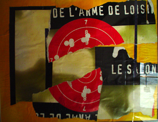
L'arme de Loisier Parsons' collages are composed with intricate consideration, but occasionally she moves with a speed and daring any skater would admire. L'arme de Loisier, the source of the postcard, is striking in its force and simplicity. A billboard poster is torn into three large pieces and rearranged on a painted orange ground. The poster's large red target with white numbers and bullet holes is torn neatly in half. The tension created by the divided circle is the central dynamic in Parsons' composition, and sets the other elements in motion. Although Parsons is primarily focused on composition, there are interesting contextual shifts that occur in her work. It seems too comfortable to explain the placement and meaning of words in her work as randomly determined by composition. The original poster seems to have been for an art show of some kind. Its completed text would read Le Salon de L'arme de Loisier. The words Le Salon are positioned in the near center of the piece on the right side directly adjacent to the path torn through the red target. Essentially, this collage, a single piece in an art show, declares instead, that it is an entire show unto itself. Indeed Parsons' immediacy and bravura create a fine spectacle in an individual work. Inevitably, the question arises: was Parsons drawn to the original poster only because of its bold color and design, or is the target yet another contextual reference to the artist Jasper Johns? Johns used the target as a frozen pattern that could only convey meaning as a signifier, stilling the heroic dynamism of abstract expressionism. L'arme de Loisier suggests a playful compromise: the harmless coexistence of semiotics and intuitive composition within a modernist mode. Parsons moves with agility through various artistic modes, and ultimately the only real unifier to this body of work is that it is all collage. If you force yourself to ignore this simple fact, her work becomes highly diverse. In Artifact and Red Letter Day Parsons shifts suddenly to a completely representational mode, working in a Matisse-like manner, rendering vases full of flowers in cut paper. Parisian is pure color field abstraction reminiscent of Stuart Davis. The title of the piece is forcefully stenciled in the center, playfully disrupting the lyricism of the abstraction. 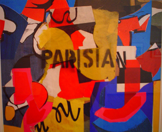
Parisian Parsons' multiplicity is a testament to her talent as a teacher. She is completely comfortable thinking along several divergent lines simultaneously. Her complexity is sometimes lost as she intentionally explores specific limited channels. The representational vase pieces are lovely and decorative, but don't quite approach the virtuosity of L'arme de Loisier or the multilayered complexity of what I think is the best piece in the show, Cimabue. 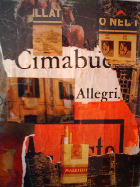
Cimabue Cimabue is the artist who discovered and trained Giotto. Stories of his reckless and daring life rival the reputation of his art. Once, when asked for a portfolio of drawings to secure a commission, Cimabue refused and simply drew a perfect circle on a piece of paper saying, "This is all the proof you need." Parsons' Cimabue operates with a similar bravado. Central in the composition is the word "Cimabue." Just beneath "Cimabue" is the word "Allegri," a term used to identify the pacing in music, meaning to play quickly. Both of these words have been torn from the same poster, and the rest of the composition revolves around them. This piece functions well as a pure modernist composition, but engages contextual and semiotic meanings with equal dexterity. In the upper region of the collage, a snapshot has been cut in half and applied. The picture is of the same posters Parsons uses in her compositions. One half of the snapshot advertises a performance by the London Symphony Orchestra while the other announces a show of nudes by Edward Weston. The rest of the composition consists of arranged photos of buildings. The final element is an image cut from a magazine of a package of Raleigh cigarettes. The appeal of this piece is the complexity of the associations. All of the imagery seems related, but somehow it never quite connects, and the viewer is left with a feeling of memory block, of something almost, but not quite remembered, a fleeting sensation: Cimabue, Quickly. This is Parsons at her most eloquent, creating a visual record of a remembered experience embedded in a modernist composition. Parsons' work overall shows how the personal investment of an individual artist can give a method of working continued relevance beyond its declared position in the progress of the canon. It would be nice to see the work framed without glass however, as the glass unifies surfaces that are sometimes excitingly disjunctive. 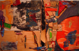
Untitled Skateboarder Paul Fujita's work addresses similar issues of collage and composition in unexpected ways. Working in a skate shop, Fujita collects and reassembles broken skateboards into (collages?) objects that inhabit the limbo between painting and sculpture. If considered paintings, the pieces are highly refined abstractions. Fujita peels the graphics off of broken boards and reverses them, creating intricate filigrees of raised plastic pigment. The larger, unbroken segments of skateboard serve as grounds for drawing and painting vignettes, to the effect that many of the pieces contain smaller works embedded in them. Delicate, maze-like traceries of graphite on gesso embellish the broken boards. Image transfers of map fragments and botanical diagrams appear in almost all of the compositions. Fujita focuses on mark making. This can be seen clearly in the painting vignettes, which have something in common with Cy Twombly. The most exciting aspect of Fujita's work is his use of the marks that occur on the skateboards during tricks, when the surface of the board grinds along an edge. Fujita composes with these found marks, appropriating them as drawings. This sets up a complex relationship between object and velocity within the process of production. The skateboards begin as art objects that are marked and destroyed by the velocity of the tricks performed. The pieces are then reassembled into abstract compositions. However, the assembly process is something like setting cobblestones, each piece must be shaped (usually by sanding on griptape) to fit into the gap in the composition. Effectively, a grid is created, a highly static composition. It is the skateboards themselves that still carry the velocity and expressive potential of their destruction. That expressive potential exists in the final piece as the history of the object, while the composition acts to control it, and fit it into the frame of the painting. 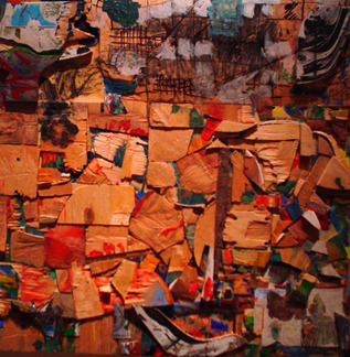
Untitled Fujita's process strikes me as the absolute reverse of expressive painting, in which inert materials (paint) are invested with velocity through the act of their composition. Fujita works to control the volatile history of his materials, and his results are just as expressive. This work is adventurous within the discourse of painting, and I am not sure Fujita needs to be so committed to the rectangle in his future compositions, although it perfectly solidifies the internal grid. I can envision future states of this work in which the outline grows organically based on the accretion of the pieces themselves. -Isaac Peterson Isaac Peterson is an artist and freelance writer from Juneau, Alaska. He has recently completed his Masters in Fine Art at the University of Cincinnati. His writing can also be seen in Artweek magazine. Posted by Isaac Peterson on July 27, 2005 at 18:32 | Comments (0) Comments Post a comment Thanks for signing in, . Now you can comment. (sign out)
(If you haven't left a comment here before, you may need to be approved by
the site owner before your comment will appear. Until then, it won't appear
on the entry. Thanks for waiting.)
|
| s p o n s o r s |
 |
 |
 |
 |
 |
 |
 |
 |
 |
 |
 |
 |
 |
 |

|
Site Design: Jennifer Armbrust | • | Site Development: Philippe Blanc & Katherine Bovee | |

