|
||
|
Portland art blog + news + exhibition reviews + galleries + contemporary northwest art
|
||
Ken Kelly Rocks 
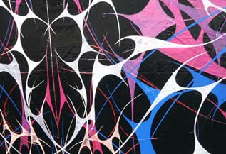
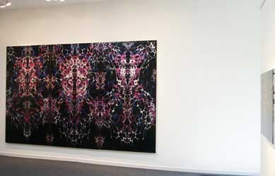
Skull (detail) I've always liked aspects of Ken Kelly's work, probably because of its non-western use of arabesques and attention to surface. Yet, his earlier works seemed to be too intentionally oriental and antiqued in ways that I found equally troublesome. No longer. Kelly's latest show at Pulliam Deffenbaugh dubbed, Babble, is just as meticulous as before but now sports a Spinal Tap like twist that is more nostalgic, humorous and ambitious. The work is inspired by 80's metal, proving once again that abstraction, like some great imulsifier can appropriate pop culture and give it new freedom. In fact, none of this newfound rock and roll undermines the work's seriousness and artists like Philip Taaffe, Jackson Pollock and Frank Stella all have some relationship to Kelly in that intense patterns threaten to extend beyond the painting's surface. Such intense pattern is simply too much to fully take in and makes the painting behave like things seen out of the corner of one's eye, even when we are looking right at it.  Skull (left), I.D. #1 (right) A good example is the twelve foot wide painting, "Skull." The work in many ways is dressed in shiny black like Rob Halford of the band Judas Priest. "Skull" is larger than life, suitably decked out in pattern and surface pyrotechnics with it's rock star iridescent spiky webs of magenta, cerulean blue and milky white which dance above the dense black surface. The tantalizing black pavement for a ground is not perfectly flat, which sets up tension with the intricate designs on top. These graphic designs are symmetrical while the corrupted surface becomes a study in asymmetrically. The overall effect, like 80's metal is mostly showmanship and ridiculous precision coupled with an existential physical gusto that justifies itself. No this isn't some hair band like Winger which was all about ballads. It is definitely Judas Priest and "breaking the law" through devil may care behavior. By virtue of its size and detail "Skull" is a 30 minute guitar and drum solo of art. It might even be similar to Gene Simmon's pointy dragon face paint and obscenely long tongue? One either gets the liberating ridiculousness of it all or they go off on some diatribe about how the blues (as performed by Eric Clapton in an Armani) are so pure. Also, the exciting inconsistencies of Skull's surface are more like a live performance than a studio album, giving the work an immediacy that makes it sparkle. All in all it's like an existential condensation of the excesses of painting technique marshaled into a tongue and cheek tribute to 80's metal. "Skull" even manages to evoke influences like the Alhambra and the symmetrical perfections of the Taj Mahal. Moorish art iconoclastically banished the figure from art and I find the fact that these paintings are rock stars without the annoying personality refreshing. Lastly, the filigree designs are reminiscent of neo tribal tattoos and possibly Patty Smyth's ultra 80's "The Warrior" video on MTV. 
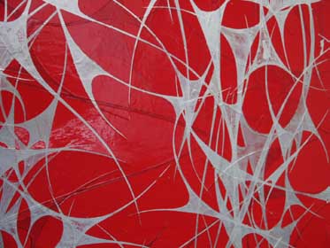
I.D.#3 (detail) Other works like "I.D.#3" really shine because of their stark material contrasts. I.D.#3's shiny red ground highlights the more matte white webs. These webs symmetrically float upon it like whip cream on a Ferarri in a way that reminds us how pattern and surface is often appropriated into class consciousness. Another standout is "I.D. #1." It is a small black piece covered in more diaphanous spiky webs of iridescent magenta. I.D. # 1 more Goth, and reminds me of one of my old guitar students, a young Mormon kid who practiced Mixolydian and Dorian (modal) scales on the fretboard in order to rock a little harder and piss his parents off. Yes 80's metal was a horrible aberration of 70's glam and a form of never to be rivaled hair spray abuse but Ken Kelly goes a long way to giving it something like dignity. Why? Because it requires such discipline and sensitivity for the painting's surface and support to pull these off. In the wrong hands this type of work easily becomes a mere technical exercise or formula (like bad 80's metal) but Kelly avoids the trap of being too precious. July 2nd is the last day of the show so throw the horns and rock a little. Posted by Jeff Jahn on June 30, 2005 at 22:49 | Comments (0) Comments Post a comment Thanks for signing in, . Now you can comment. (sign out)
(If you haven't left a comment here before, you may need to be approved by
the site owner before your comment will appear. Until then, it won't appear
on the entry. Thanks for waiting.)
|
| s p o n s o r s |
 |
 |
 |
 |
 |
 |
 |
 |
 |
 |
 |
 |
 |
 |
 |
 |

|
Site Design: Jennifer Armbrust | • | Site Development: Philippe Blanc & Katherine Bovee | |

