Portland art blog + news + exhibition reviews + galleries + contemporary northwest art

recent entries

Early September Links
Labor Day Weekend Picks
Museumy Links
Wendy Given at Vernissage
Mid August Links
Grace Kook-Anderson in Conversation
Portland Art Adventures
Early August Art News
August must see picks
End of July News
Alia Ali's Borderland at Bluesky
Mid Summer Reads

recent comments

categories


Book Review
Calls for Artists
Design Review
Essays
Interviews
News
Openings & Events
Photoblogs
Reviews
Video
Links
About PORT

regular contributors


Tori Abernathy
Amy Bernstein
Katherine Bovee
Emily Cappa
Patrick Collier
Arcy Douglass
Megan Driscoll
Jesse Hayward
Sarah Henderson
Jeff Jahn
Kelly Kutchko
Drew Lenihan
Victor Maldonado
Christopher Moon
Jascha Owens
Alex Rauch
Gary Wiseman

archives


Guest Contributors
Past Contributors
September 2018
August 2018
July 2018
June 2018
May 2018
April 2018
March 2018
February 2018
January 2018
December 2017
November 2017
October 2017
September 2017
August 2017
July 2017
June 2017
May 2017
April 2017
March 2017
February 2017
January 2017
December 2016
November 2016
October 2016
September 2016
August 2016
July 2016
June 2016
May 2016
April 2016
March 2016
February 2016
January 2016
December 2015
November 2015
October 2015
September 2015
August 2015
July 2015
June 2015
May 2015
April 2015
March 2015
February 2015
January 2015
December 2014
November 2014
October 2014
September 2014
August 2014
July 2014
June 2014
May 2014
April 2014
March 2014
February 2014
January 2014
December 2013
November 2013
October 2013
September 2013
August 2013
July 2013
June 2013
May 2013
April 2013
March 2013
February 2013
January 2013
December 2012
November 2012
October 2012
September 2012
August 2012
July 2012
June 2012
May 2012
April 2012
March 2012
February 2012
January 2012
December 2011
November 2011
October 2011
September 2011
August 2011
July 2011
June 2011
May 2011
April 2011
March 2011
February 2011
January 2011
December 2010
November 2010
October 2010
September 2010
August 2010
July 2010
June 2010
May 2010
April 2010
March 2010
February 2010
January 2010
December 2009
November 2009
October 2009
September 2009
August 2009
July 2009
June 2009
May 2009
April 2009
March 2009
February 2009
January 2009
December 2008
November 2008
October 2008
September 2008
August 2008
July 2008
June 2008
May 2008
April 2008
March 2008
February 2008
January 2008
December 2007
November 2007
October 2007
September 2007
August 2007
July 2007
June 2007
May 2007
April 2007
March 2007
February 2007
January 2007
December 2006
November 2006
October 2006
September 2006
August 2006
July 2006
June 2006
May 2006
April 2006
March 2006
February 2006
January 2006
December 2005
November 2005
October 2005
September 2005
August 2005
July 2005
June 2005

contact us


Contact us

search


syndicate


Atom
RSS

powered by


Movable Type 3.16

This site is licensed under a


Creative Commons License

Tuesday 06.07.05

« Superflat Earth Society | Main | Art Wars? »

Jacqueline Ehlis at Savage

glitter.jpg


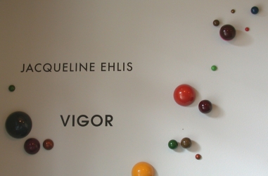
An arc of glossy semi-spheres are loosely configured around the entrance of Savage Art Resources. These seductively colored orbs appear to push out from the wall, violating the boundary that separates gallery from the outside world. It's a fitting introduction to Jacqueline Ehlis' show, at once giving the viewer a playful wink while slyly indulging in formal exploration of the relationship between painting, surface and the white box.

In her current show, entitled Vigor, Ehlis delves further into some of the explorations seen in her previous solo show at Savage's former Pearl District space in 2002. In the excellent DVD that was produced in conjunction with this exhibition, Ehlis poses the question of whether or not paint is a sophisticated enough medium in the 21st century. She eloquently answers this question by embracing a studio practice that is as rigorous conceptually as aesthetically. Ehlis, who is one of the most articulate artists I've encountered in Portland, is masterful at combining the depth of her intensive studio practice with more cerebral content in a way that never fails to deliver immediate visual pleasure. A former student of Dave Hickey at UNLV, Ehlis avoids dwelling on the more conceptual aspects of her work, although I find the depth of her formal investigations to be even more rewarding than her very likeable visual sensibility.


vigor.jpg


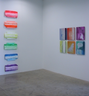
The three series of work installed in the front room all share an interest in breaking down the normal relationships between paint and surface. The six Laughy Taffy works are configured as a vertical column comprised of rectangular panels, each treated with a different color from Ehlis' signature palate of fluorescents. A slab of thickly layered paint is awkwardly mounted atop each panel, extending beyond the edges, but leaving parts of the background panel exposed. Here, the component parts of painting are broken down into the simplest distinctions of paint and ground, taken apart, and reconfigured to emphasize these layerings. The series of Necessary Abstractions on the adjacent wall deny us the pleasures of the Laughy Taffy works, from their satisfyingly sculptural presence to their fluorescent radiance. These six digital photographs document gestural paintings using what we are led to believe is the same set of colors we see in Laughy Taffy. These colors, inadequately rendered through the photographic process, have lost their luminosity and the illusionary mounds of white paint are revealed to be photographic manipulations of light and shadow.

The most extreme example of breaking apart the layers of painting occurs in Ehlis' series of planks, arrangements of freestanding slabs of chalky white paint with Plexiglas and wood, casually leaned against the wall. The separation of surface from grounds is complicated by the insertion of clear, and in some cases fluorescent pink and neon Plexiglas. If these are sculptural equivalents of painting, then the Plexiglas could be imagined as a stand-in for a number of things - pure color, gloss finish, the transformative effect of fluorescent pigment on the surrounding space, or perhaps even some sort of non-material aura.

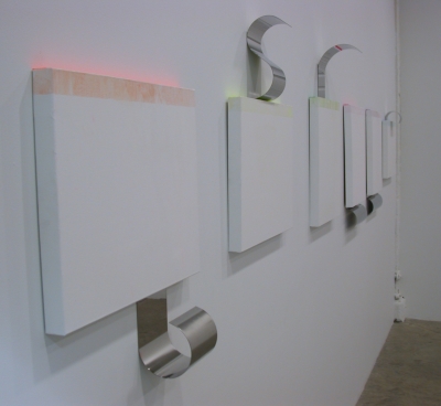
Works in the back gallery rely on this notion of a painting's aura. Large, airy canvases retain a very gestural touch through their use of layered washes, referencing the hand of the artist more overtly than any other work in the show. A series of sparse canvases with metal appendages make use of a literal aura due to the use of fluorescent paint, as well as the metaphorical aura referenced by titles like Lifted Love, Lifted Emotion and Lifted Universe. While the sculptural metallic sheets literally lift off the canvas, lifted also seems to refer to the notion of transcendence. The reflective metallic surfaces that extend into the gallery space serve as mirrors that capture the image of its surroundings, and sometimes the viewer, involving the artwork, viewer and white box in some sort of abstracted otherworldly communion.


lifted.jpg


Posted by Katherine Bovee on June 07, 2005 at 17:12 | Comments (0)


Comments

Post a comment

Thanks for signing in, . Now you can comment. (sign out)

(If you haven't left a comment here before, you may need to be approved by the site owner before your comment will appear. Until then, it won't appear on the entry. Thanks for waiting.)


Remember me?


s p o n s o r s
Site Design: Jennifer Armbrust   •   Site Development: Philippe Blanc & Katherine Bovee